Base layout
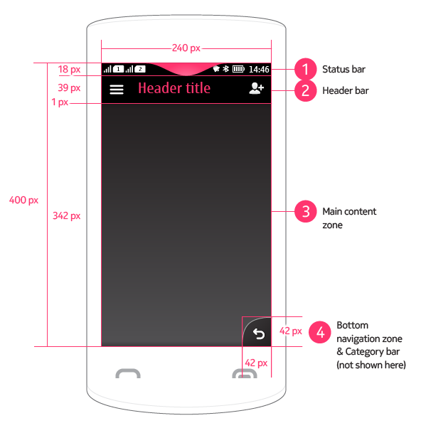
The base layout is the main layout in Series 40 full touch. It defines the generic zones in the UI screen estate.
 |
1 Status bar
|
Portrait vs. landscape
Series 40 full touch UI supports two views of screen orientation: portrait and landscape.
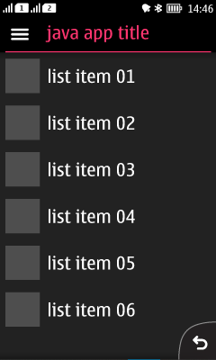
In portrait view, the page is vertically oriented with the send and end key at the bottom of the device, and the height of the page is greater than the width. Portrait view is the standard view, and should be supported in all applications.
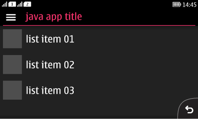
Landscape view can additionally be supported where this adds value (e.g. camera, photo gallery). For those apps that support both portrait and landscape, the appropriate orientation is used according to the orientation sensor.
Both orientations share status bar, header bar and category bar. The only difference is that in landscape view the header bar height decreases in size from 40 to 34 px to allow more screen real estate for content. Furthermore, in landscape view the category bar expands across the screen, allowing a maximum of six visible categories.
Orientation changes must be done only by rotating the device. If an application supports only one view, no changes should happen in case of rotation. Orientation changes should always be consistent and share the same transition for all applications. All orientations maintain focus on the primary content and generally its layout shouldn’t change drastically except for few cases when changes celebrate user generated content.
In exceptional cases an app may support only landscape, not portrait, but this must only be where the content is wholly landscape-based (e.g. video playback).


Right-to-left languages
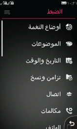
Text fields in layouts are mirrored for right-to-left languages, for example in lists and Alerts and pop-up lists.
List items with icons are fully mirrored: the list icon is placed at the right side with right-aligned text next to it. Vertical scroll bar is placed at the left side of display.
Any interactive elements – such as category bar icons, Back button etc. – should not be mirrored. Action buttons remain in their position regardless of language.
